Empowering users through intuitive financial planning
About the client
Allswealth is a new FinTech startup with a mission to revolutionize financial planning. They recognize that financial planning can be really challenging and is often reserved for high-net worth individuals, making the service inaccessible and often too complex for the masses.
The company believes that everyone deserves the opportunity to achieve financial independence and the ability to build the life they wish to live. Which is why they created a web app to harness the power of a financial advisor, without the expensive price tag.
Services provided
- User Research
- User Experience (UX) Strategy
- Web App User Interface (UI) Design
- Marketing Website Design
- Brand Direction
The challenge
The founders of the product had done a great job of creating a functional prototype to test and perfect their algorithm, but the product lacked a polished, intuitive user experience. The algorithm generated a lot of valuable insights and data, but the product didn’t adequately distill which information was most valuable to the users and display it in a way that was easy to understand.
Furthermore, the client had invested in developing a new logo identity before approaching us, but the full visual application and brand messaging had not been developed. We only had their logo and brand colours to work with, lacking a clear direction for their brand strategy at the outset.
With these challenges in mind, we needed to design a Minimal Viable Product (MVP) that had a well-thought-out user experience with clear information hierarchy and a strategic application of their new brand identity to get the product ready for market.
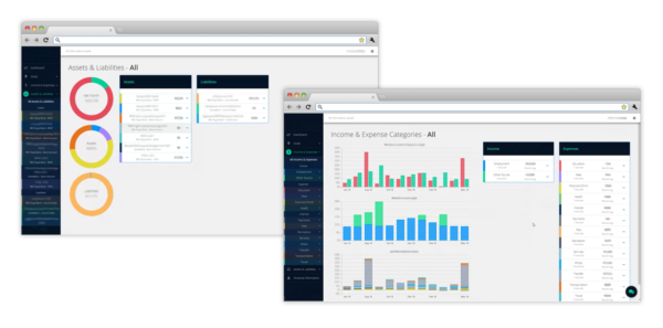
Original Web App
The research
To start off, we assessed where the client currently stood with the product: the problems they were trying to solve, who their target users were and what solutions they were planning to deploy. We questioned their assumptions and identified gaps in knowledge that needed to be uncovered and validated.
Through the use of questionnaires, user interviews and secondary research, we were able to identify and classify users into three categories. These categories were based on their priorities and their spending, saving and investing habits. Common trends and patterns surfaced among the three user types which later informed our design decisions about the functionality and features we needed to include. This also helped clarify what information was relevant to users, ensuring we were providing value with the product.
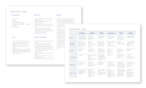
The strategy workshops
Working together with the client, we conducted strategy workshops where we developed user personas and user journeys to gain a better understanding of the various steps users had to go through when interacting with their product.
By walking through the user journeys, we were able to identify user pain points and brainstorm potential features and functionality ideas together to optimize the user experience. Lots of great ideas were generated, but it wasn’t feasible to include them all. We used some prioritization exercises to hone in on the most valuable features for the MVP and developed a long-term plan for rolling out the other wish-list features in multiple phases.
The user flows
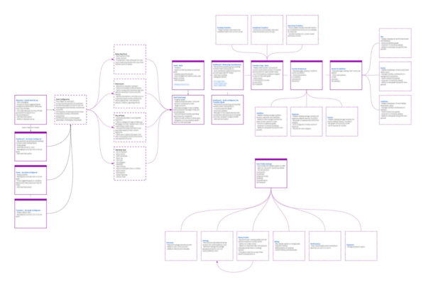
Once we had narrowed down the functionality, we needed to create a master plan for how all the features would fit together into one coherent product. Using the user journeys to inform the overall user flow, we developed a flow map of all the various components of the product and how they all connected together at a high level. This map addressed the various screens, states and interactive components that needed to be considered when we moved on to the next step of putting together the wireframes.
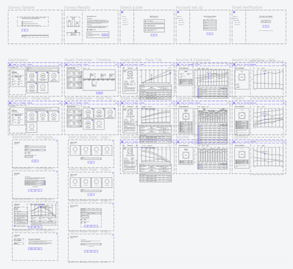
The wireframes
Now that we had a good idea of how the overall flow was going to work and what pages we needed to design, we created rough wireframes to mock up the functionality we envisioned for the MVP. These low-fidelity designs allowed for rapid idea exploration of presenting information and accomplishing tasks in various ways. From here, we were able to create low-fidelity prototypes to test task flows and iterate and optimize the user experience before creating high-fidelity designs.
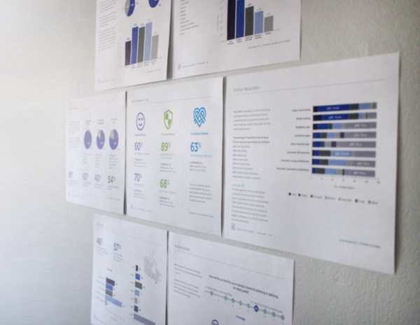
The moodboards
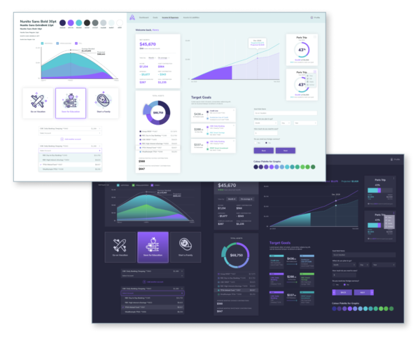
Once we had the functionality mapped out, it was time to establish the user interface design. This is also where the branding came into play. Rather than jumping in and designing the end product’s user interface screens right away, we created moodboards of user interface elements we expected to use in the final product. Two different approaches were created using the same primary brand colours but applied in different ways to give it a distinct look and feel.
Creating moodboards was a fast way to determine if the user interface design will accurately reflect the brand’s desired look and a quick way for the client to flag anything that didn’t feel right for their brand. This also allowed us to experiment with multiple ways of visually showing the same information and determine the best approach to use before it was applied product wide.
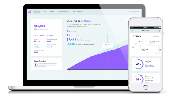
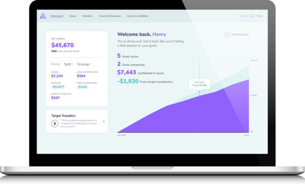
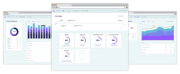
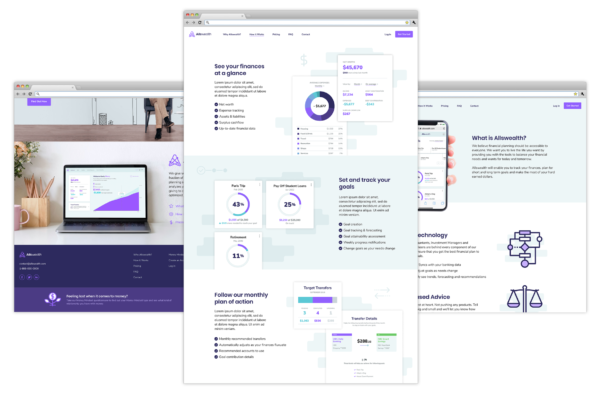
The final web app
After we had established the design direction, the branded user interface elements were applied to the wireframes and refined into high-fidelity interactive prototypes. These interactive prototypes are ideal for usability testing to ensure the user flow works as intended and also serves as a useful reference for the development team to understand the intended functionality.
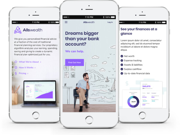
The responsive mobile designs were created simultaneously to ensure the user experience was considered holistically, making sure the transition to smaller screen sizes didn’t compromise on the user’s overall experience of the product.
The marketing challenge
In addition to the design of the web app, we were also tasked with redesigning the client’s marketing website. Their existing website was created using a generic template which lacked branding and contained content that no longer accurately reflected the product’s evolution. A new website had to be designed which reflected the new brand identity and accurately depicted the capabilities of their Minimal Viable Product.
Original Marketing Website
The new marketing website
Since a deep dive into the company’s brand was outside of the scope of work involved, the marketing website became an extension of the web app’s overall look and feel. We revamped the website’s architecture and developed a plan for the content to highlight the most noteworthy features of the product. We also assisted with writing high level content for headlines and important marketing messaging to ensure we addressed the targeted audience appropriately.
The outcome
The client had originally approached us with the task of creating a few user interface screens for their product. They were not familiar with the product development process and the amount of planning, testing and validating required to bring a tech product to market. They humbly allowed us to guide them through the process, and were flexible and open to new ideas as the product evolved. As a result, we were able to work together collaboratively and ensure we developed a good product that not only satisfied their business goals, but was designed with the end users in mind.
Client takeaways
- Better understanding of their target users & their needs
- Optimized onboarding flow for new users
- Prioritized most essential features for MVP
- Discovered new valuable features
- Solidified the marketing messaging and brand
- Access to ongoing UX/UI support, as needed
Words from the client
“Collective Experience has been a pleasure to work with. They’ve taken the time to understand our product at a fundamental level and developed a well-thought-out UX strategy which shows in the beautiful UI/UX produced. It evokes the feeling we were looking for while also simplifying and refining the interactions with some of the more complex parts of our application, optimizing the user experience to encourage customer conversion and retention.”
William Lindsay
Co-Founder & CTO, Allswealth